EMPIRE
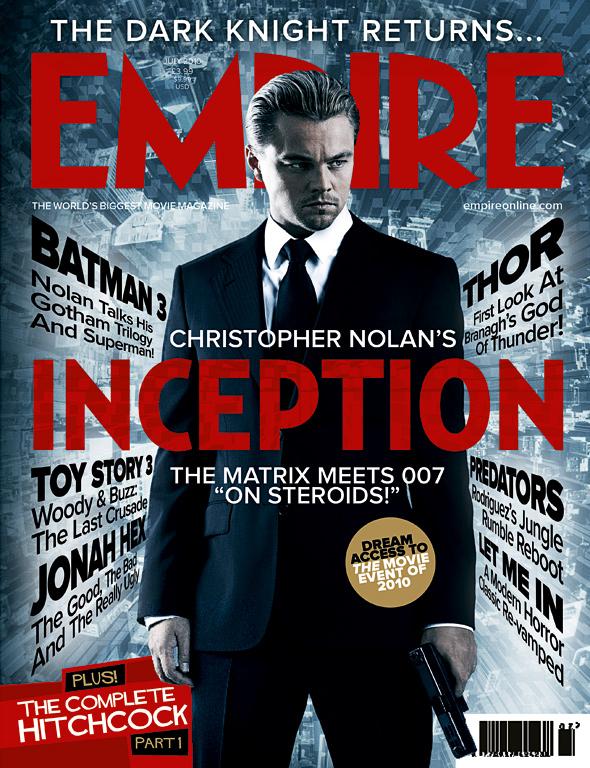
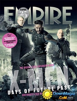
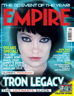
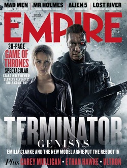
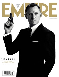
Empire Magazine always have their main image characters in costume. Magazine covers range from having lots of text and detail (e.g Inception) to have a very simple but effective cover, (e.g Skyfall). The magazine also sometimes have special covers for subscribers or special edition magazines for big releases. Also, there is a range in covers in terms of the main image. For some, the over will include 2 or more characters as exemplified in the Terminator cover, and some just include one character, e.g Skyfall. A variety of shots are also used for the main image, such as a close up (Tron Legacy) showing the facial expressions on the actresses face, or a mid-shot such as X-Men where we can see 3 characters and their costumes. For every cover of Empire, the actors and actresses are always in costume and the magazine focus more on the film rather than the actors/actresses. Also the background fits in with the film and it's genre as well as the surrounding text. The Inception magazine cover has the text slanted, almost like it is distorted which fits the film storyline. As Inception wasn't as big of a release like Skyfall, the Inception cover has lots of surrounding information about other films, whereas the Skyfall cover, one of the biggest films of all time, is simple and stands alone with no information about other films. The title of the magazine is always at the top, and usually in red as shown in 3/5 of the covers. However this is changed to fit the colour scheme, for example in the x-men cover, a red title would clash with the greys and blacks. Also the title is generally overlaid by the main image, but in some cases, e.g Tron Legacy, the main image is underneath the title.
|
|
|
|
|
TOTAL FILM
Each Film magazine cover from Total Film is reflective of the film posters and genre. For example, skyfall uses a sparse amount of gold, black and grey to convey the prestigiousness of Bond. Whereas The hunger games uses splashes of yellow, red and orange to portray the action and danger element to the film centred around destruction and misconduct. The Total Film logo is always at the top and generally the main image is centred and overlaps it. A tagline about the magazine is at the top enticing the reader to the magazine such as 'the cool issue'. To one side of the magazine is usually 10 biggest films/must sees, reviews, and what pages to find exclusive interviews and gossip. The titles tend to be through the characters in the style of the film and different to the other text to draw attention to it. The colours always reflect the genre and the colour schemes of the films. Red is a commonly used colour for text or bold statements to stand out to the reader. Barcodes are present on all of them in different places as they can be purchased. Something about the actor or something about the character is mentioned such as a motive in the film or a play on words name dropping the main actor/actress to interest a readership.

|

|

|

|
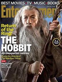
ENTERTAINMENT WEEKLY
The layout of entertainment weekly magazines are quite similar in all of the magazines that have been released. The image of the character is the main focus as it is very large and located in the middle of the page. The image of the character is almost always placed in front of the Heading 'entertainment'. From the examples shown above all of the magazines have chosen to keep the actors in character, this helps to give the audience a gist of what kind of film it is and gives them an idea of what kind of theme to expect from the film. For example In the magazine which has the characters of twilight standing together in a way which implies that they are in love, the audience will expect romance in the film due to the representation given in the magazine. The font is consistent throughout all of entertainment weekly magazines. The font in which they present the title is the same in every poster. The colour used for the film title is often white as this stands out with the choice of background. In the Captain america magazine, the colour of the title and the entertainment logo, both are red, this makes it bolder and brighter and therefore catches the audiences eye. The background colour used in a lot of the magazine covers is blue/grey. Using a fairly neutral colour in the background makes the writing and the image stand out more as its not muted by a bold background colour.

|

|
|

|
